Case study
The Artful Life
A concept redesign for The Artful Life, an expressive-arts counseling center and studio with locations in Salem and Beverly, Massachusetts. I wasn't hired for this one. I took it on because I was genuinely taken with what they do, and saw a real opportunity to help their site feel as considered as the practice itself.
- Role
- UX/UI redesign, web design, build
- Year
- 2026
- Tools
- Next.js, Figma, Claude Code, GitHub, Vercel
The idea
Where feelings find a shape.
The Artful Life already lives in color and art. That's the whole point of the practice, and the redesign was never about changing who they are. The guiding idea was giving that existing warmth a clear structure to live inside, so all the personality finally has room to breathe instead of competing for attention. I'm a big fan of colorful sites myself, but even the best color story needs something holding it together, or it starts to read as noise instead of warmth. Same soul, just a frame that lets it show without shouting. The quotes stayed. The colors stayed. The photography, the painting video, the personality, all of it stayed. I just gave it somewhere organized to live.
Before and after
The homepage, at a glance.
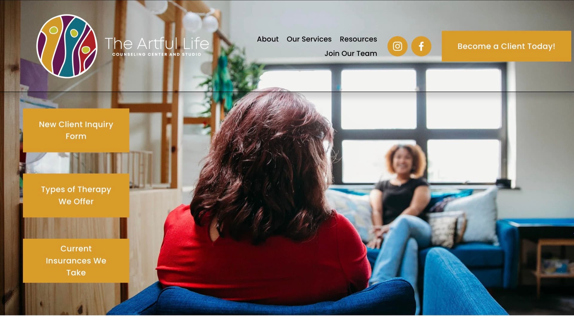
Their homepage stacks a full-bleed photo, three overlapping call-to-action boxes, and a dense nav into one crowded hero. The nav is not sticky, so once you scroll down it disappears. Getting anywhere else means hitting the back button or scrolling all the way back to the top.
The redesign gives each job its own space: a clear headline, two focused calls to action, and the practice's color and doodle system introduced right away. The nav stays pinned as you scroll, so any page is one click away from anywhere on the site. Photography throughout mixes some real images from the practice with the site's existing stock choices.
Watch it scroll
The system
Color & doodle system.
The Artful Life's color and art identity is already strong. It just wasn't applied consistently from page to page. A five-color system pulled from their own logo, used the same way everywhere: a gradient divider between sections, a rainbow border around every photo, and a different pastel doodle greeting each page.
- About
- Team
- Programs
- Become a Client
Each page carries one hand-drawn doodle that animates in once as you arrive and then stays put. The stepping stones on Become a Client are my favorite, because they are also a picture of what the intake process feels like: one step at a time.
The newsletter form
Seventeen checkboxes, or six.
Their newsletter signup asks how you heard about them, then answers it with a column of seventeen checkboxes. That is a long read for a question that is really just marketing research. I grouped the same answers into six color-coded chips you tap rather than tick, and moved the newsletter consent to a single line at the end. Same information, a fraction of the reading.
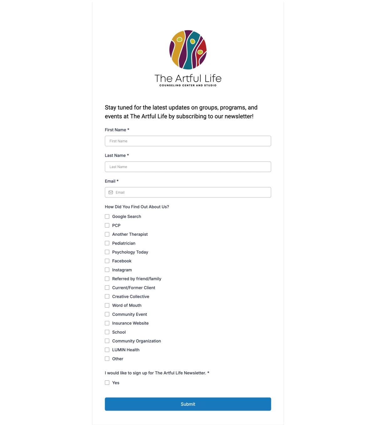
Their newsletter signup. Seventeen checkboxes for one question.
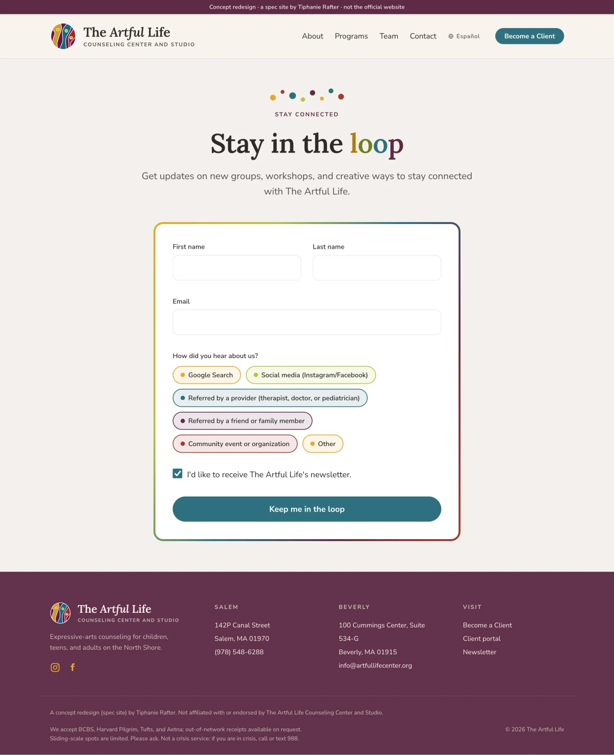
The redesign. Six chips, each carrying one of the practice’s five brand colors.
On a phone
The same programs, half the scrolling.
Their programs page runs as one continuous column of color blocks and unbroken paragraphs, so finding a single group means reading past all the others. I gave each program its own card with a photograph, an age range, a duration, a short list of what you will actually do, and the schedule. Same information, but you can scan it.

Their programs page on a phone.

The redesign, one card per program.
It actually works
Pretty is the easy part.
Measured, not claimed
The Artful Life today
97 · 96 · 92 · 100
This redesign
100 · 100 · 100 · 100
Same Lighthouse audit, same four categories. Their live site already does well, at 97 / 96 / 92 / 100. The redesign takes every one of those to a perfect 100. Not a matter of taste, a matter of measurement.
Google Lighthouse, desktop. Performance · Accessibility · Best Practices · SEO.