Case study
BLAZE
A complete brand identity for a fictional social platform where everyone is over 21. I designed the mark, the palette, and the type system, then documented all of it as a thirty-two page brand book.
- Role
- Brand identity, guidelines design
- Year
- 2026
- Tools
- Adobe Illustrator
A spark worth sharing.
A social platform for grown-ups.
BLAZE is a fictional social networking platform for adults 21 and over, built for a course brief. The assignment asked for a brand that felt premium and community-driven while staying clearly distinct from the platforms people already use. The deliverable was a complete visual identity system, documented in a 32-page guidelines file that another designer could pick up and work from.
Research
Looking at the competition first.
Before choosing a single color, I researched the three platforms BLAZE would sit next to: Facebook, Instagram, and X. The pattern was immediate. Facebook owns a saturated blue. Instagram owns a sunset gradient. X owns stark black and white. All three use sans-serif type and a simple mark that survives being shrunk to an app icon.
That told me two things. The logo had to work at notification size, which is non-negotiable in this category. But the color could be the point of difference, because every major competitor was sitting in cool, saturated territory.
Color
Earth tones, on purpose.
So BLAZE went warm. Rust, taupe, and deep brown read as grounded and adult rather than bright and youthful, which suits a platform whose whole premise is that it's for people who have outgrown mainstream social media. It also means BLAZE is recognizable in a feed of app icons purely by temperature, before you've registered the shape.
Rust
#B75F2D
Taupe
#B8A48D
Brown
#473A33
Gray
#85807A
Logo
A flame that's also a conversation.
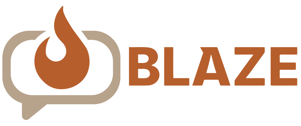
The mark folds two ideas into one shape: a flame inside a speech bubble. The brand is called BLAZE and the product is conversation, so the logo carries both without needing either spelled out. It reads as a flat silhouette, so it survives at app-icon size, the one place a social brand cannot fail.

Logomark
Print: 10mm / Digital: 50px
Logotype
Print: 50mm / Digital: 150px
Full logo
Print: 50mm / Digital: 150px
Type
One typeface, three jobs.
Aa
ExtraBold — Headlines
Aa
SemiBold — Subheads
Aa
Regular — Body
Inter does everything. ExtraBold carries headlines, SemiBold handles subheads and calls to action, Regular takes body copy. Restricting the system to a single family with defined roles means the hierarchy stays legible whether it's a billboard or a push notification, and it gives anyone applying the brand later a rule instead of a judgment call.
Applications
How it holds up in the world.
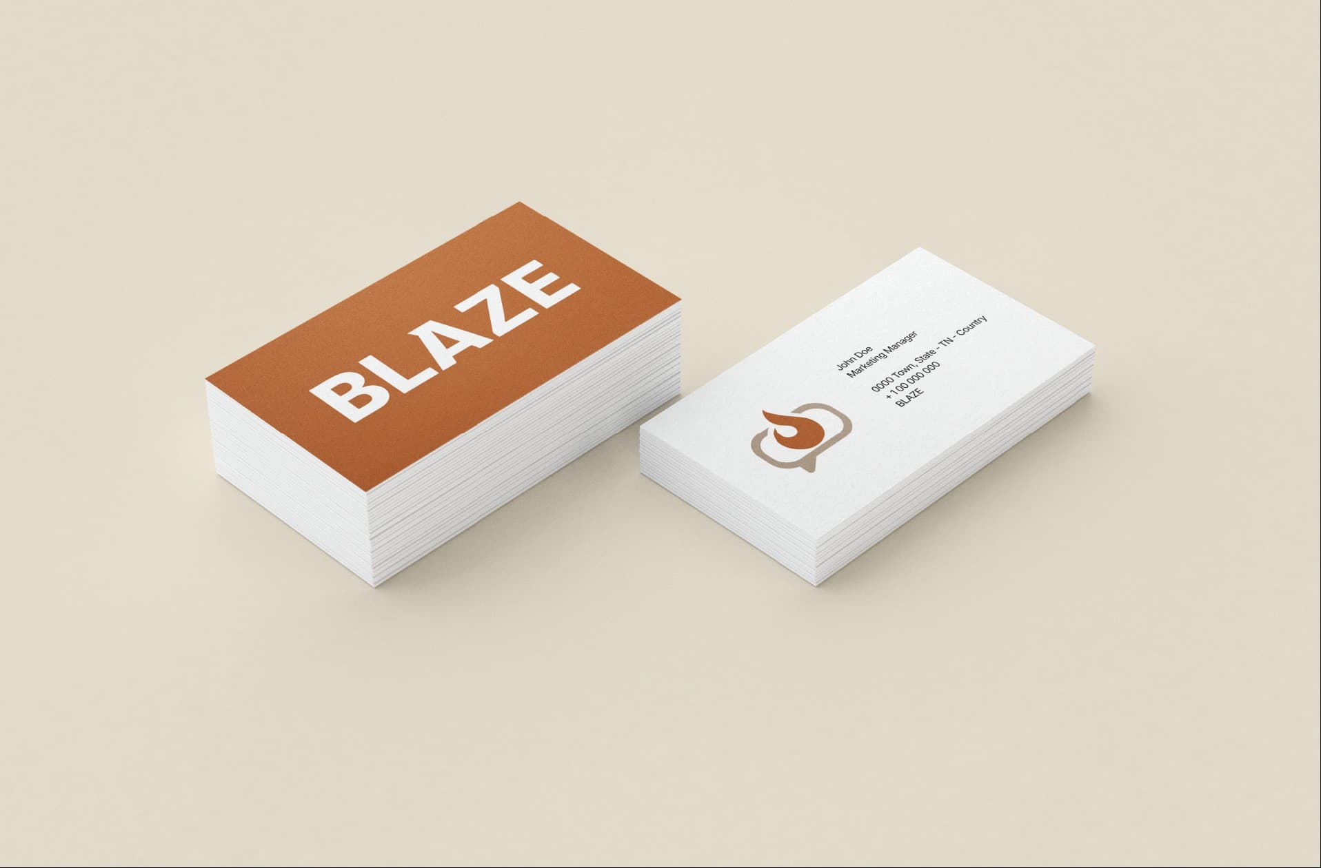
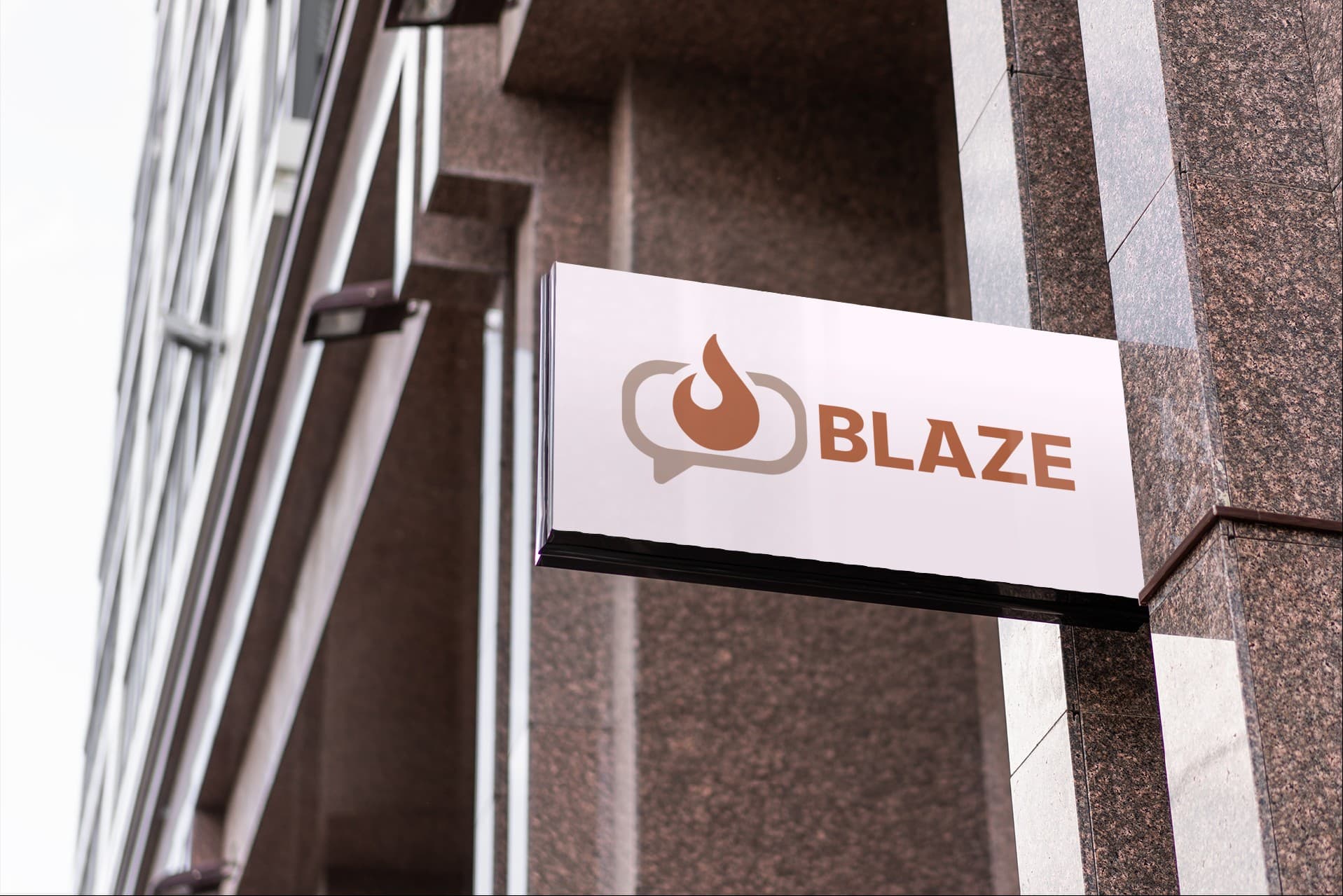
Identity systems fall apart at the edges, so I tested the mark where it would actually live: printed small on a business card, embroidered on merch, and scaled up on exterior signage. Each one puts different pressure on the logo, and the mark held its shape in all three.

The full guidelines.
Thirty-two pages covering logo construction, clearspace and minimum sizes, misuse, the full color system, type hierarchy, and applications.
Download the PDF