Case study
Community Cup
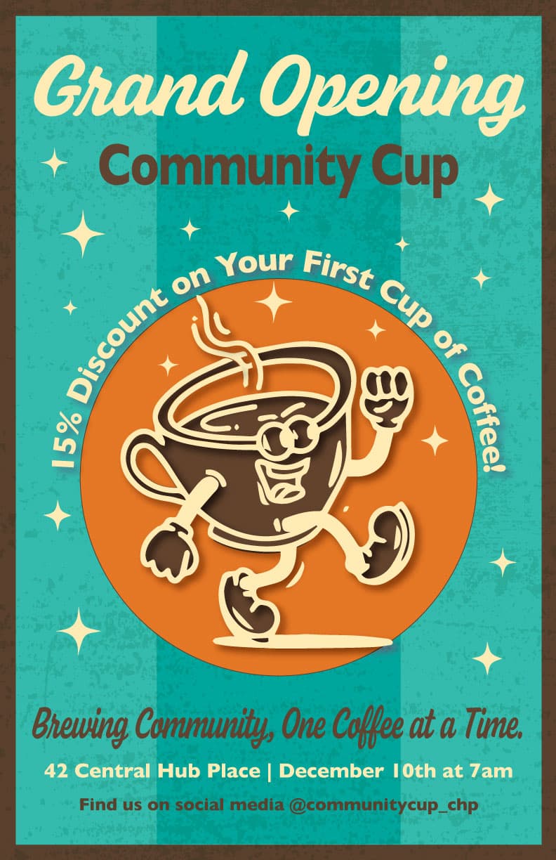
A grand opening poster for a neighborhood coffee shop that does not exist. The brief asked for a warm, inclusive gathering place for all ages, and the poster had to make an opening feel like an event the whole block would turn up for.
- Role
- Poster design, illustration, typography
- Year
- 2023
- Tools
- Adobe Illustrator
- Course
- GRA 205
The concept
A friendly face for a new corner shop.
I chose a 1950s diner aesthetic for its welcoming charm and its reach across generations. Rather than photography, the poster is carried by a walking coffee cup with a grin, because a mascot can be friendly in a way a photograph of a latte cannot.
Everything else follows from that decision. The palette came from vintage coffee advertising: orange for warmth, brown for the reliability of the drink itself, turquoise for calm, and cream for contrast. Nostalgia was the point, since a new shop has no history of its own to trade on.
The research
Where the look came from.
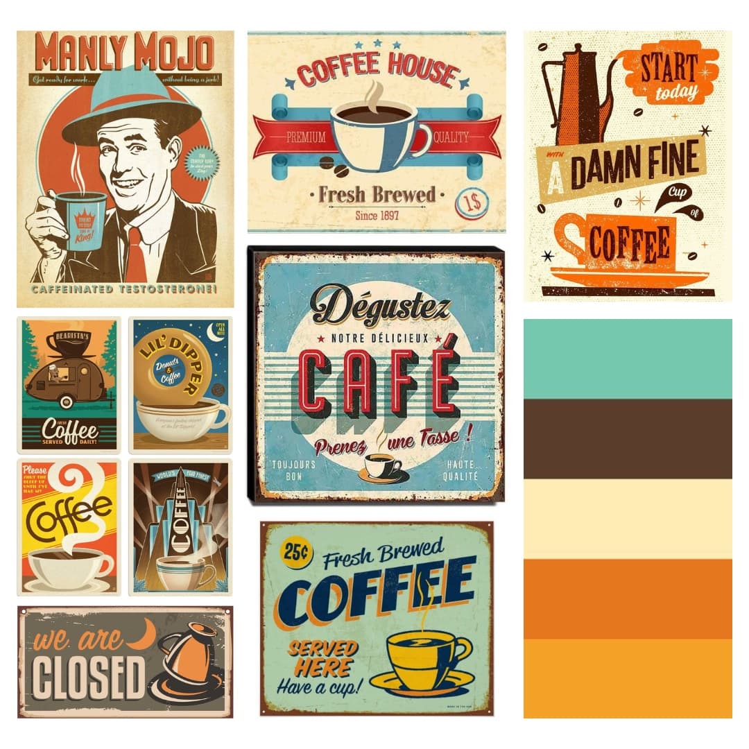
I built a mood board from vintage coffee advertising and diner signage before drawing anything. It settled the palette and it settled the structure. Arched type in the references became the curved discount line, circular badges became the round mark behind the mascot, and the starbursts scattered across mid-century signage became the background accents.
The layout
The offer, on a curve.
The discount is the reason someone walks in on opening day, so it sits on a circular path arcing over the mascot. The curve does two jobs: it makes the most commercially important line the most visually distinctive, and it introduces movement into a composition that is otherwise built from circles and straight rules.
Beneath it the information descends in the order someone actually needs it: the shop's name, then the promise, then where and when, then where to find them. Cream on turquoise carries the headline, and dark brown carries the detail, so nothing competes with the mascot at the center.
The system
Four colors, two jobs each.
#08C2B5
Turquoise
#F97216
Orange
#FFF3E2
Cream
#5A3D29
Brown