Case study
Farm to Table CSA
A fictional family farm in Elberta, Alabama, and a measure of how far a year can take you. I built a four-page site for it partway through my degree, working from a brand style guide I was given. A year later I came back and rebuilt the whole thing as a single page, using everything I had learned since.
- Role
- Web design and build
- Year
- 2025, rebuilt 2026
- Tools
- Adobe Illustrator, Next.js, Vercel
The brief
A brand I was handed.
The brand came with the project: a hand-drawn logo with a carrot and fork, a palette of brick, forest, and sage, and a type pairing of Red Hat Display and Zilla Slab, all documented in a style guide I was given rather than one I made. When I came back to rebuild the site, none of it needed to change. The brand was never the problem.
The problem
Four pages, one page of content.
The original site spread roughly 450 words across four Bootstrap pages. Every page was a card floating in gray space, the brand colors barely appeared, and the one question every CSA visitor arrives with, what does a share cost, was buried two clicks deep.
The structure existed to make people click, not to organize anything. So the rebuild started with a structural decision: one page, one scroll, prices visible within the first two swipes.
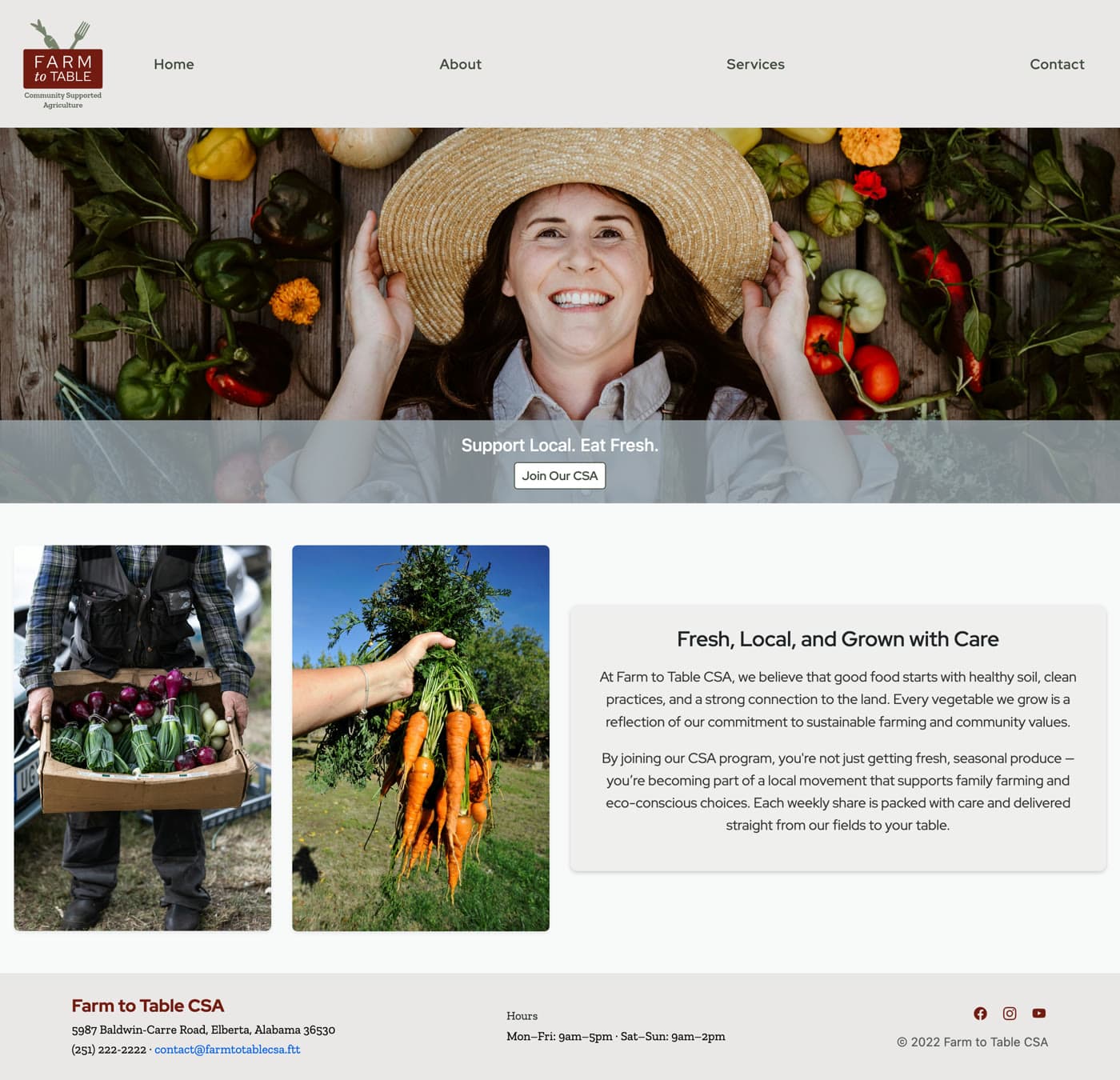
Home
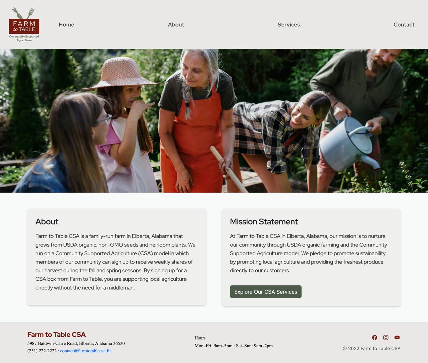
About
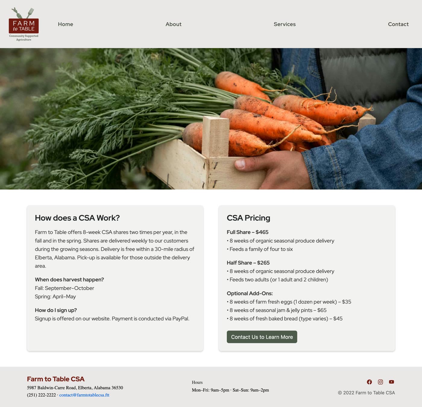
Services
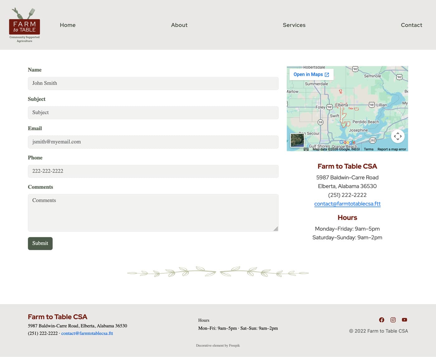
Contact
Note
The original site, all four pages. Roughly 450 words spread across four Bootstrap templates, with the price of a share buried two clicks deep on the Services page.
The rebuild
Warm chrome, working photography.
The palette has no bright color in it by design, so the photography has to carry all the warmth. Every image was chosen against a measured tonal band, and the one video on the page, two farmers walking a field row at golden hour, sets the temperature the rest of the imagery has to match.
The personality lives in the details: a block-print starburst frieze, hand-stamped illustrations marking each step, a woven texture on the quiet sections, and torn-paper edges between them. Everything else stays out of the photography’s way.

Note
The whole page in one view. The scroll reveals, the marquee, and the header video only really happen in a browser, so it is worth a look.
Measured, not claimed
The scoreboard.
- 100
- Performance, desktop
- 100
- Accessibility
- 100
- Best Practices
- 100
- SEO
Note
Google PageSpeed Insights, August 2026. Desktop scores 100 across all four categories. Mobile scores 99 for performance and 100 for accessibility, best practices, and SEO. The whole page weighs about 1.3MB including video, and every animation respects reduced motion.