Case study
Feral Bloom
A small-batch botanical brewery in Salem, Massachusetts, built on one idea: every beer starts with a wild New England plant nobody planted. I designed the brand and built the site: seven pages on one design system, from the moth on the label to the reservation form.
- Role
- Brand identity, web design, build
- Year
- 2026
- Tools
- Ship Studio, Adobe Firefly, After Effects, Photoshop
The brand story
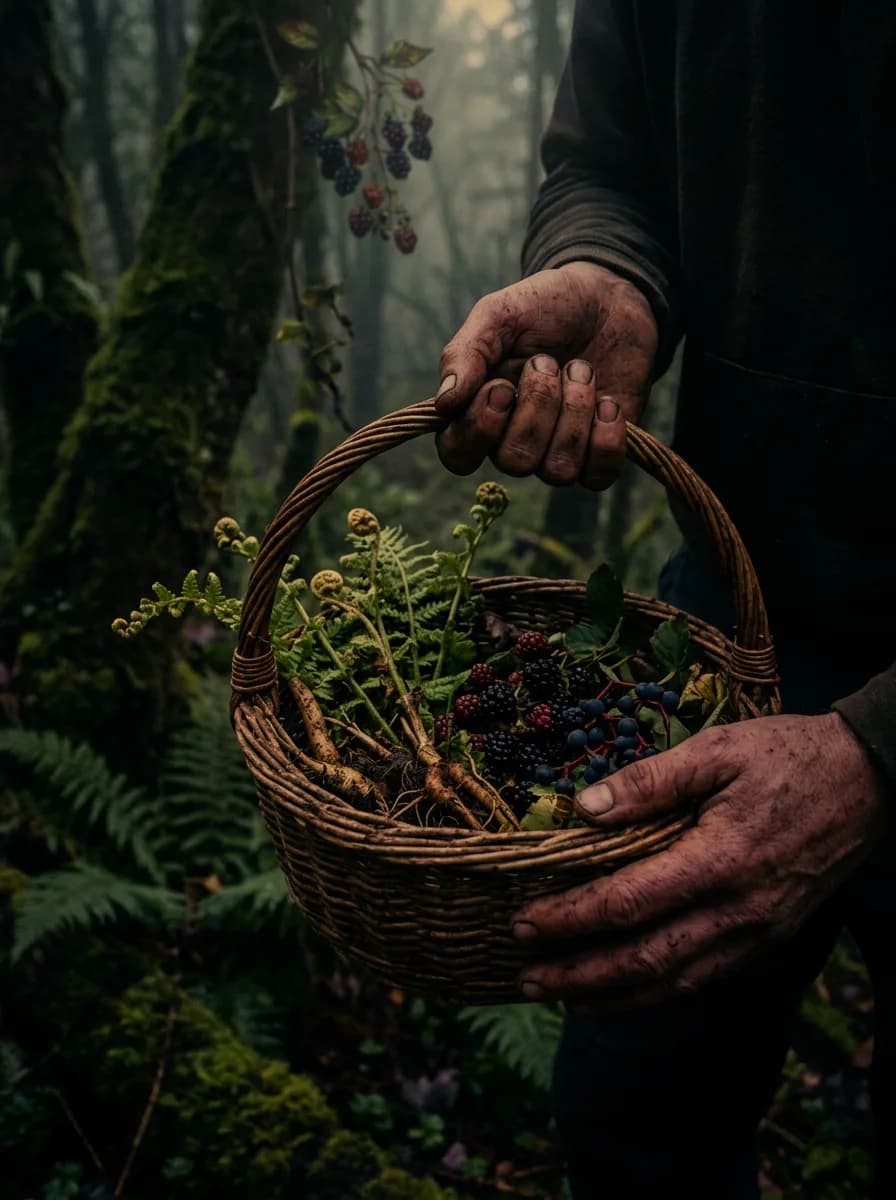
01 · Forage
Foraged, not farmed.
The story opens in the woods, where every beer begins: with a wild New England plant nobody planted.
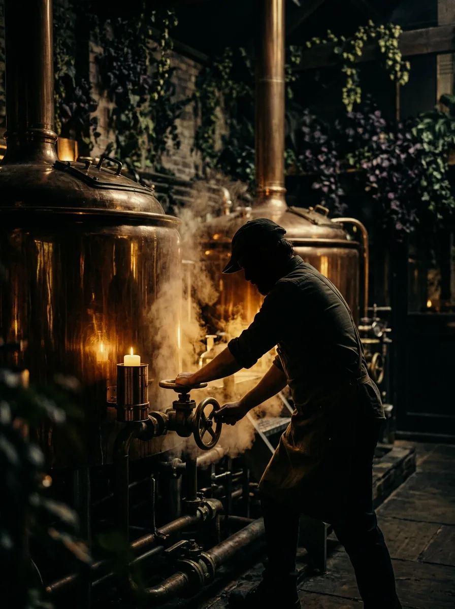
02 · Brew
Small batches, old traditions.
Small-batch brewing, done the slow way, rooted in three hundred years of herbal tradition.
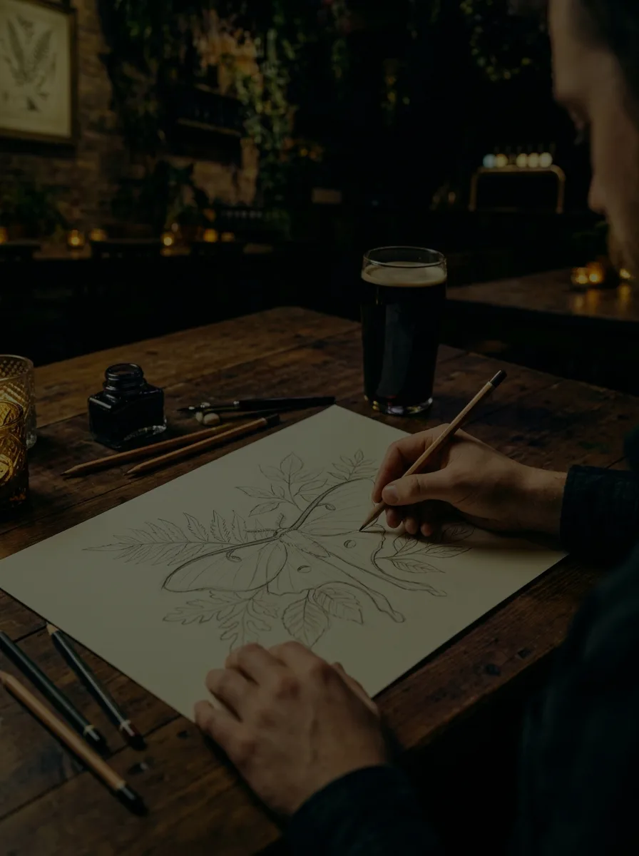
03 · Document
We show our homework.
Every label names the botanical inside it. The brand shows its process instead of hiding it.
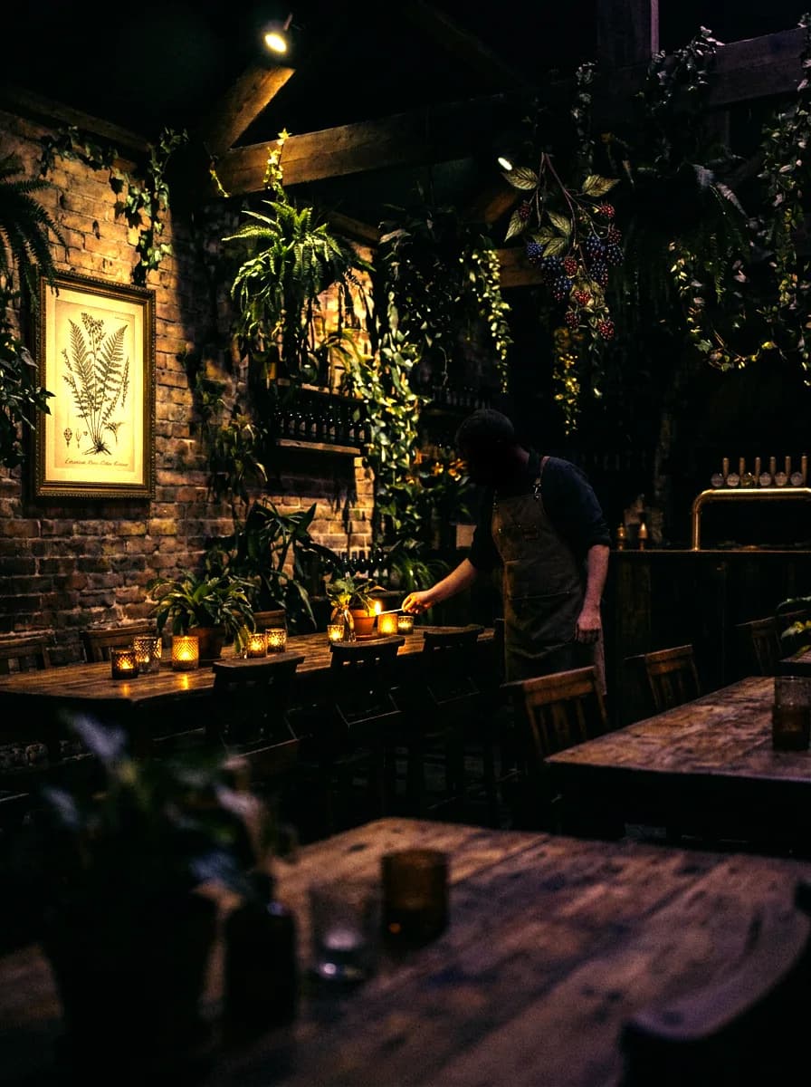
04 · Gather
For gathering, not just drinking.
The story ends in the taproom, the place all of it leads to.
Note
The brand story, plant to glass to table. A gold thread runs the length of the sequence, numbered like specimen pins, with the photographs alternating sides. Recreated here in live HTML rather than screenshots.
The idea
Wild things grow in the dark.
Every beer in this concept carries a foraged New England botanical, so the design had to earn that idea rather than just illustrate it. I chose a near-black palette with warm gold accents so the site reads like candlelight instead of a typical bright, fruity beer brand, and built the whole system around one recurring hand-drawn mark (the moth) so a single detail could tie together the logo, the labels, and the site's wayfinding without needing a heavier brand system. The goal was restraint: let one idea do a lot of work instead of decorating every page separately.
Every photographic image across this concept was generated in Adobe Firefly, chosen specifically to nail a consistent, candlelit atmosphere for an entirely fictional brand. The moth logo itself was hand-sketched, then built out in Adobe Illustrator.
Note
The moth started as a sketch concept, then I used Adobe Illustrator to develop it into clean vector art. It's the one mark that repeats everywhere: labels, packaging, the site's favicon, tying the whole system back to a single drawn detail.
The system
One system, seven pages.
Home, beers, story, taproom, society, events, and a journal, all sharing one set of type sizes, one grid, and a repeating specimen-card layout for each beer. The section background shifts as you scroll, plum to near-black to a warm reddish-brown to green, so the dark never goes flat.
The build
It works, not just looks.
The reservation, event, private-hire, and newsletter forms all send real submissions. The header runs a custom looping video, the moth draws itself in as you scroll, images fade in as they arrive, and all of it turns off for anyone who prefers reduced motion.
- 100
- Performance, desktop
- 100
- Accessibility
- 100
- Best Practices
- 100
- SEO
Note
Google PageSpeed Insights, August 2026. Desktop scores 100 across all four categories. Mobile scores 98 for performance and 100 for accessibility, best practices, and SEO.
The header video shipped at 2.3MB. Compressing it to 759KB and serving the poster frame as AVIF brought total page weight down from 2.98MB to 1.26MB, with nothing on screen changing.