Case study
Fresh Fare Farms
A multi-channel advertising campaign for a meal kit delivery service built on locally sourced, sustainably farmed ingredients. The brief: launch during Hunger Action Month, where every signup triggers a produce donation to a local food bank. Three deliverables across three channels, one campaign.
- Role
- Campaign design, print, digital, social
- Year
- 2026
- Tools
- Adobe InDesign, Photoshop, Illustrator
- Course
- GRA 415
The brief
Working inside someone else’s brand.
This project came with what most student work never has: a client brief and a finished brand guide I had no hand in creating. The avocado mark, the palette, the Filmotype LaSalle script paired with Futura PT, all fixed before I started. The job was not to invent, it was to apply, which is most of what advertising design actually is.
The audience was fixed too: 21 to 35, students and young professionals, short on time, active on social media, and motivated by a company’s values as much as its product. Everything had to be simple, fast to read, and driven by imagery.
The system
One layout language, three channels.
I chose the tagline Local. Sustainable. FRESH. from the client’s three options because its rhythm survives at any size, three words that work as large as a magazine page and as small as a banner footer.
The system that carries across all three pieces: photography in rounded white frames, organic shapes in the brand’s eggplant and avocado, the seed motif repeated as a background pattern, and the script reserved for the words that matter most. Every photograph shows real people or real food in natural light, matching both the brand guide and the audience the brief described.
The deliverables
Print, pixels, and a swipe.
The magazine ad carries the full campaign message, built in InDesign for print: the offer, the donation mechanic, and the signup URL, organized so the eye lands on the headline, the offer, and the tagline in that order.
The digital banner strips the same campaign down to one sentence and one button, built in Photoshop at skyscraper proportions, where every word has to earn its narrow column.
The Instagram carousel tells the story in three swipes, built in Illustrator: the hook, the cause, and the call to action. Each artboard stands alone in a feed, but the seed pattern and palette make them unmistakably one campaign.
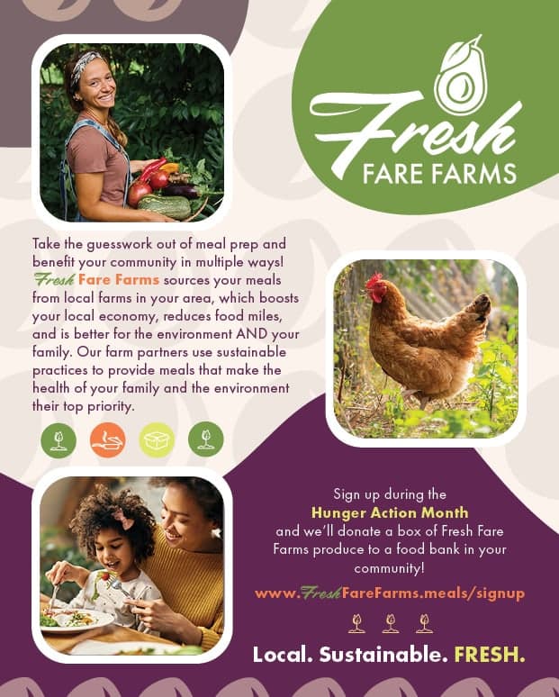
Full-page magazine ad · InDesign

Animated skyscraper banner · Photoshop
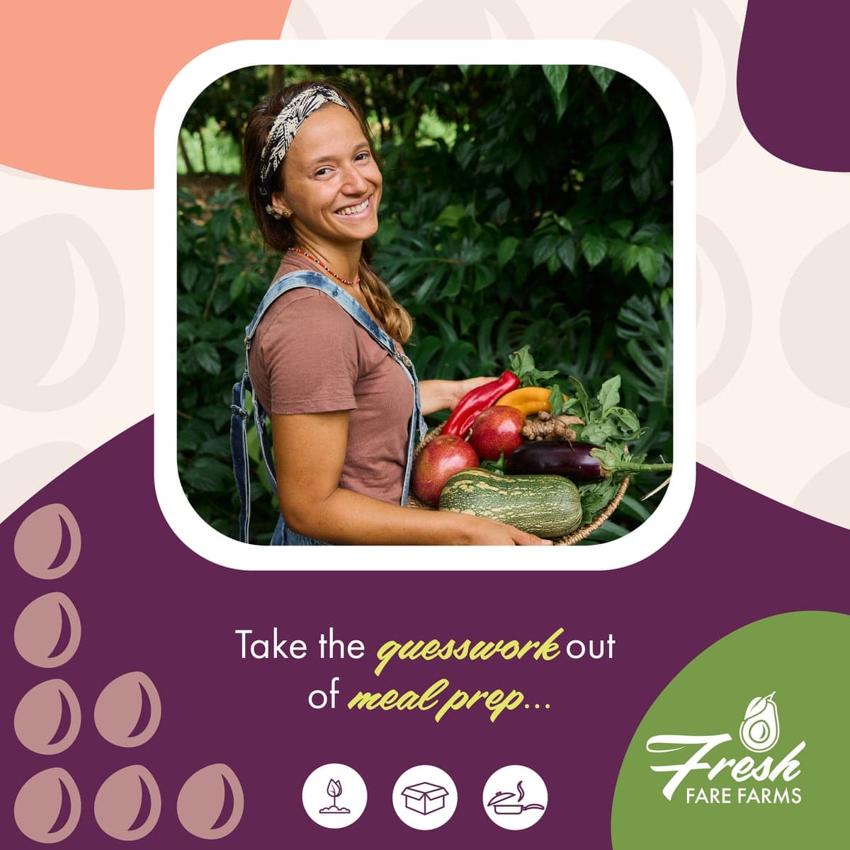
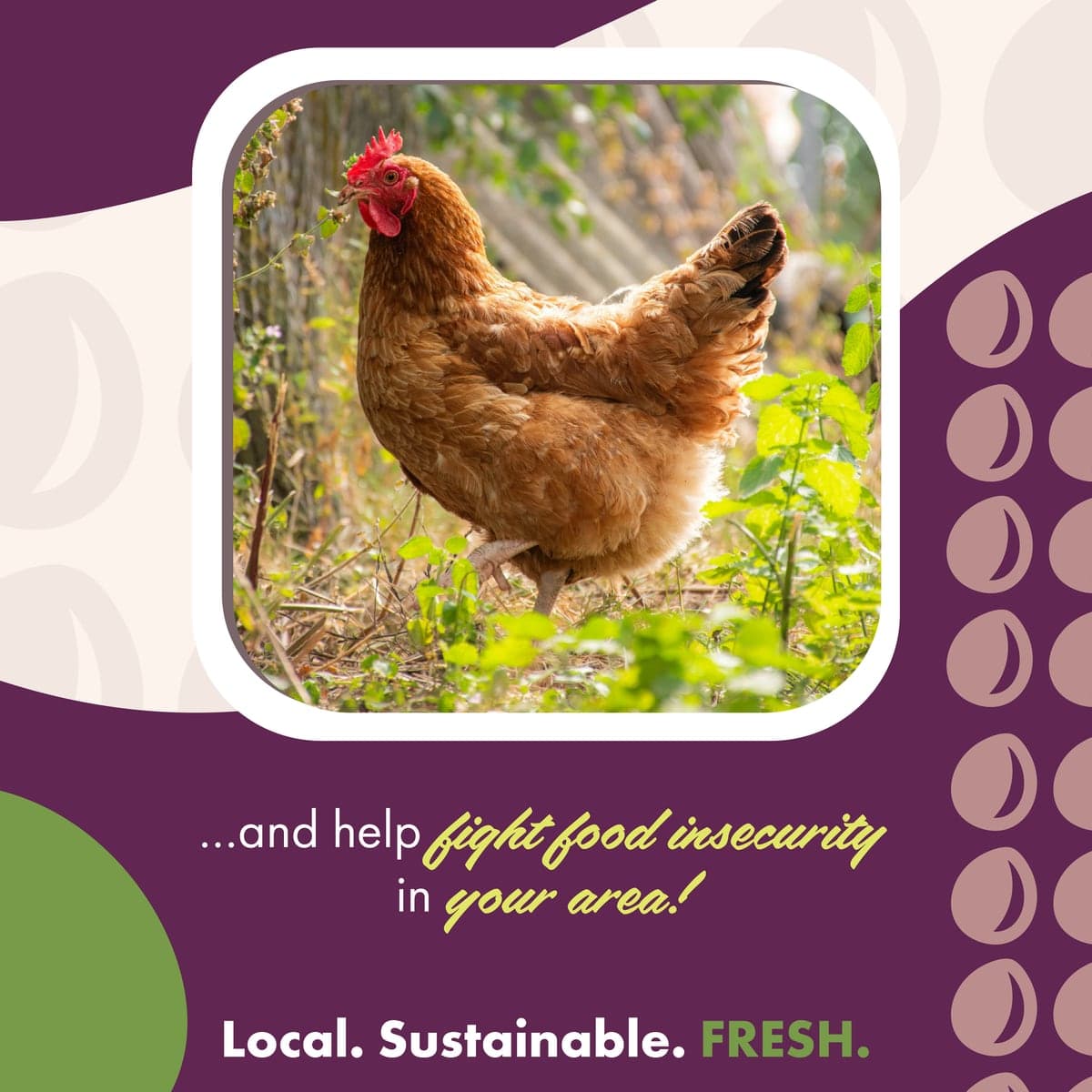
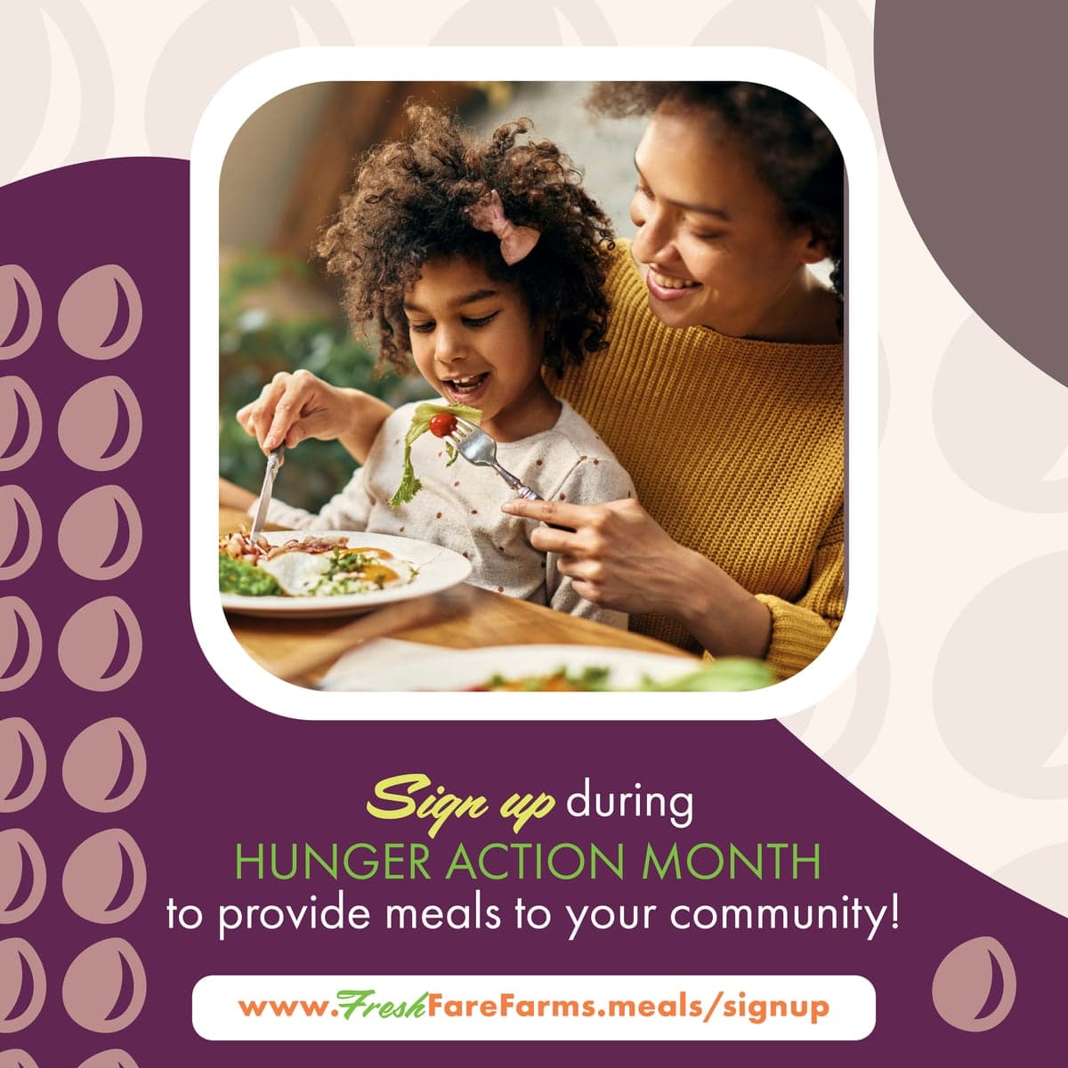
Instagram carousel, three artboards · Illustrator · Swipe to browse