Case study
Horizon Railways
A growing passenger railway moving its tickets off paper and into a phone. The brief asked for three design options, all the information the paper ticket carried, plus two things it never had: a picture of where your seat actually is, and whether the train has Wi-Fi.
- Role
- UI design, user experience
- Year
- 2026
- Tools
- Figma
- Course
- GRA 470
The problem
Nobody could find their seat.
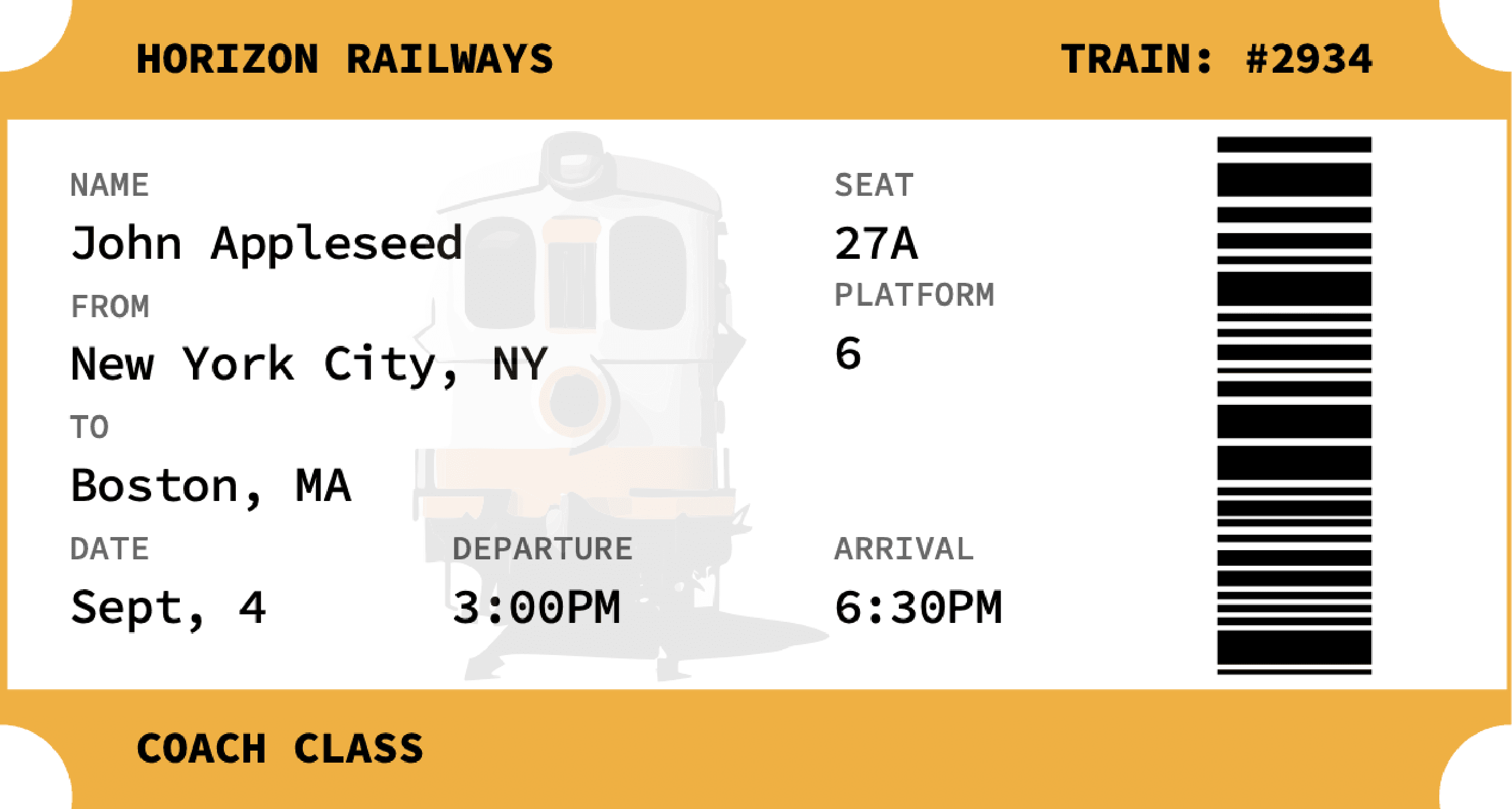
The brief was unusually direct about what was wrong. The single biggest complaint about the existing ticket was that passengers could not find their seats. The old ticket printed "27A" and left the rest to you.
So every one of the three designs is answering the same question in a different way: where am I sitting, and how do I get there from the door?
Note
The existing paper ticket, supplied in the client brief. It prints the seat number and nothing else, which is why passengers could not find their seats.
The people
A commuter and an engineer.
The client supplied two personas and they wanted different things. Alex, 28, a software engineer who travels constantly, wants to find the seat and sit down without asking anyone. Emily, 21, a student who commutes to campus, needs the same thing plus certainty that there is Wi-Fi, because the journey is when she does her coursework. One needs speed. The other needs the Wi-Fi indicator to be impossible to miss.
Three options
The same question, answered three ways.
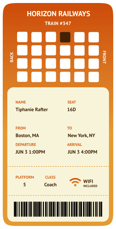
The first puts a compact seat grid at the top with the carriage running left to right, front and back marked on the sides. It reads fastest, and it treats the map as a glance rather than a study.
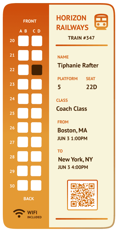
The second splits the ticket down the middle, with a full carriage map running the height of the card on the left and every row numbered, 20 through 30. It takes more space, but you can count your way to the seat from the door.
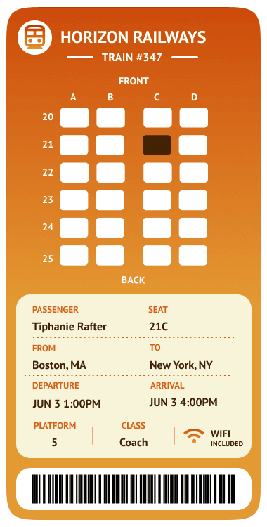
The third sits between them: a labeled grid with rows and columns marked, front and back called out above and below, and the details in a cream panel beneath. It is the version that would survive being read in a hurry on a platform.
The system
Built to be reused.
All three share one component set and one autolayout structure, so the seat cells, the detail rows, and the panels are the same objects reused rather than redrawn. The warm gradient runs across all three so they read as one family of options rather than three unrelated ideas. That is the difference between three mockups and a system a client can actually choose from.